Tuesday, 10 May 2011
Monday, 2 May 2011
Question 7
Looking back at your preliminary task, what do you feel you have learnt in the progression from it to the full product?
From the preliminary task I have learnt that I do need to use more varieties of font to make the product look more appealing and attractive for the consumer to look at, however I do not want the product to look to too overpowering because it can put people off. I have also learnt more about taking photos, in my preliminary task I did not think about what was in the background despite it being relevant it did look far too busy to consume so with my music magazine I chose to take the photos with a very simple background so that I can adapt things easily and not waste time sorting it out.
Question 6
What have you learnt about the technologies from the process of constructing this product?
POWERPOINT – I used PowerPoint for my pitch my initial ideas, I am very familiar with powerpoint so it was a quick process for me to put my ideas together
SLIDESHARE- After making the powerpoint I had to upload it onto slideshare so that I could post it on my blog, I had never used this before but once I had a little bit of help it was easier to figure out and put onto my blog.
FIJITSU DIGITAL CAMERA- I used my own camera as I know how it works and how to create the best pictures for my magazine
INDESIGN- this is the program I used to produce my magazine, I was quite familiar to using it however I did need to practise and figure out what each tool does
PHOTOSHOP- This is the program I used to edit my pictures for example I changed the colour and made the models skin a little clearer
MEMORY STICK- this is what I used to transfer my work from home to school and vice versa
MEMORY CARD READER- So I could transfer pictures from my memory card in the camera straight onto my school account for a quicker process.
Question 5
Here is a link to my magazine with annotations to why it attracts and addresses my target audience
http://www.flickr.com/photos/62366776@N05/?saved=1
Sunday, 1 May 2011
Question 4
Who would be the audience for your media product?
The audience for my magazine is 17-24 year olds male and females. I believe this is a good area to target because many young people relate music to real life situations and can just relax reading about their favourite artists. The magazine may contain banter that only this category may understand so it makes it more personal to the consumer to understand.
Question 3
What kind of media institution might distribute your media product and why?
Distribution – The music magazines are sold in many retail shops from newsagents to music shops. Lots of magazine companies have a website that the specific target audience can subscribe to that will allow viewing of the magazine and interactions with the audience. I would like my magazine to be distributed at reparable stores such as HMV which is a music store, WHSmiths a variety of product store and possibly newsagents. A website would be made for the audience to subscribe to and the main process of the exclusive ticket offers for valuable customers/consumers.
Question 2
In what ways does your media product represent particular social groups?
I think that my magazine represents a social group and relates to my target audience because of the models used within the age range of the audience and the trend of the costumes which is simple so influences are limited. There are also a variety of camera shots to make the magazine more interesting to look at and follow.
Evaluation questions
Question 1 in what ways des your media product use, develop or challenge forms and conventions of real media products?
1. The title of my magazine. To do this I had to think about the genre of magazine which is pop and relate it to my target audience which would stand out for people to see clearly and be interested in the magazine. I decided to call it Intune because it relates to being up to date with latest music and the variety of artists that would feature in the magazine. I think its conventional because it definitely has connotations of music within the title and should draw people to it.
2. Mise en scene of images and Costumes. The pop genre is a very open genre that does not signify a specific look or unique adaptation. I chose to keep the images simple and let the models express themselves and portray themselves through expressions rather than looks and appearances such as clothes although they look up to date there was no one that stands out more than the other.
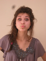
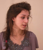
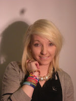
3. Models. I asked Ruth for my front cover and main article for the double page spread. I asked her because she is within the age of my target audience therefore it is easier for the audience to connect with the article and feel it is worth while reading. There are also other models male and females to make it a mixed gender magazine specifically for my initial ideas.
4. Masthead font/ title style. The title of my magazine is Intune. I tried to relate it to the genre with the splats from the title to make it stand out more, the colour of it is black because it is then suitable for various colours of backgrounds and if I needed to change the colour of the title then it is still identifiable because of the splats which identify the magazine as a pop genre.
5. Music genre. The genre is pop and highlighted throughout the magazine within text and layout, it looks fun, up to date and we use artists that are most popular with charts to interview which is the unique selling point of interviewing artists exclusively.
6. Layout. They layout of my magazine follows conventions, for example within the double page spread the body text is placed in columns which is easier for the audience to consume and follow. Another convention is the importance of articles for example within my magazine I have conveyed the importance by the size of the font to make it stand out for the audience to perceive it as the most important on the front page and contents page.
Masthead Ideas
Looking at other masthead I wanted something a little bit different that will stand out from the simple ones used most commonly for example Q magazine, although it stands out with the red background it only covers a small amount of the page so I wanted it to be seen from all different angles when on the shelves. I really like the fonts on this Kerrang magazine, they are very simple but have little quirky tweaks which makes the magazine original and stand out from others.
The font I have chosen is similar to this style of masthead but with its own unique tweak of circular splats with I think is eye catching for the target audience to look at.
Saturday, 30 April 2011
Analysis of contents page
This is an NME contents page. I like the main image in the centre of the page it stands out a lot and guides you round the page and the information below the image tells you exactly where to go and tell the audience that this is the main article of the magazine. I like the contents mast head it really stands out with the black background which is a theme carried through the magazine within the subheadings, I think the subheadings are very conventional because it divides up the sections and makes it easier for the consumer to find what they are looking for. The limited colours work for a consistent convention because it does not look to overpowering for the audience to consume. However I do feel that there is too much text to look at can I think people will just avoid the page.
Analysis of double page spread
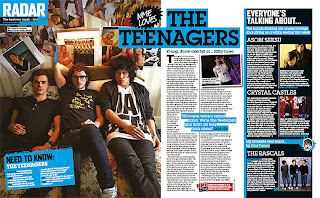
This double page spread is from NME. I think that this suits the age of my target audience well but only targets at a male audience because of the distinct colours of the blue, black and white. The key aspect of this double page spread is the image on the left hand side which really stands out and the audience is in no doubt what the double page is about, it makes it very clear with a long shot of the band. The layout out of the columns is very conventional for a magazine and it makes it easier for the target audience to read and follow. However I don’t like how close the paragraphs are to each other because there is no space it does make the page seem very busy. The small image beside the text breaks it up a little and makes it more attractive to look at as a reader. I like the bold text in the with the coloured background, this makes it stand out more and livens the page up. There is also a fact file about the band on the left hand side which is useful for new reader if they haven’t heard of the band before. There are lists of bands on the right hand side which stand out with their thoughts about a topic of discussion which could appeal to someone even though they may not be a fan of the band being interviewed.
Readership
Readership for my magazine, mainly my target audience consists of male and females aged between 17-24 however special additions of the magazine will draw in a wider audience. The specific target audience is relevant for gigs and concerts and will benefit from the exclusive ticket offers especially to the members of the magazine that subscribe to it online.
Tuesday, 8 February 2011
Initial ideas - Flat plan and changes
This is an initial idea from my flat plan. However i have found that the background image is hard to match colours with for the masthead and text, for instance the only suitable colour to go on top of the image is black, this is because of the brown cardigan and it would look very basic if i had of chosen a white background and not attract to the target audience. I was also struggling to find a suitable colour for the masthead which would look appropriate. I plan to improve this by taking new images and thinking carefully about colour schemes which will relate to my target audience. I don't think that the name of the magazine works well for my specific target audience and I think that its hard to relate it to a music magazine.
Monday, 24 January 2011
Magazine pitch
This is my magazine pitch with ideas for the magazine
Magazine pitch
View more presentations from shanaparker.
Subscribe to:
Comments (Atom)


