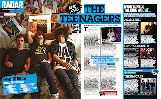
This double page spread is from NME. I think that this suits the age of my target audience well but only targets at a male audience because of the distinct colours of the blue, black and white. The key aspect of this double page spread is the image on the left hand side which really stands out and the audience is in no doubt what the double page is about, it makes it very clear with a long shot of the band. The layout out of the columns is very conventional for a magazine and it makes it easier for the target audience to read and follow. However I don’t like how close the paragraphs are to each other because there is no space it does make the page seem very busy. The small image beside the text breaks it up a little and makes it more attractive to look at as a reader. I like the bold text in the with the coloured background, this makes it stand out more and livens the page up. There is also a fact file about the band on the left hand side which is useful for new reader if they haven’t heard of the band before. There are lists of bands on the right hand side which stand out with their thoughts about a topic of discussion which could appeal to someone even though they may not be a fan of the band being interviewed.

No comments:
Post a Comment